
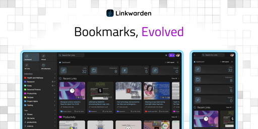
Today, we’re excited to announce the release of Linkwarden 2.13! 🥳 This update brings significant improvements and new features to enhance your experience.
For those who are new to Linkwarden, it’s basically a tool to collect, read, annotate, and fully preserve webpages, articles, and documents, all in one place. It’s great for bookmarking stuff to read later, and you can also share your resources, create public collections, and collaborate with your team. Linkwarden is available as a Cloud subscription or you can self-host it on your own server.
This release brings a range of updates to make your bookmarking and archiving experience even smoother. Let’s take a look:
What’s new:
🏷️ New Tag Management Page
We added a dedicated page where you can view, sort, add, bulk merge, and bulk delete you Tags, all in one place.

⚙️ Compact Sidebar
You can now shrink the sidebar for a more compact and minimal look.
🐞 Bug fixes and Optimizations
This release comes with many bug fixes, security fixes, and optimizations that’s recommended for all users.
✅ And more…
There are also a bunch of smaller improvements and fixes in this release to keep everything running smoothly.
Full Changelog: https://github.com/linkwarden/linkwarden/compare/v2.12.2...v2.13.0
Want to skip the technical setup?
If you’d rather skip server setup and maintenance, our Cloud Plan takes care of everything for you. It’s a great way to access all of Linkwarden’s features—plus future updates—without the technical overhead.
We hope you enjoy these new enhancements, and as always, we’d like to express our sincere thanks to all of our supporters and contributors. Your feedback and contributions have been invaluable in shaping Linkwarden into what it is today. 🚀
Also, the Official Mobile App for iOS and Android are coming very soon! Follow us on Mastodon, Twitter (X), and Bluesky for the latest updates.
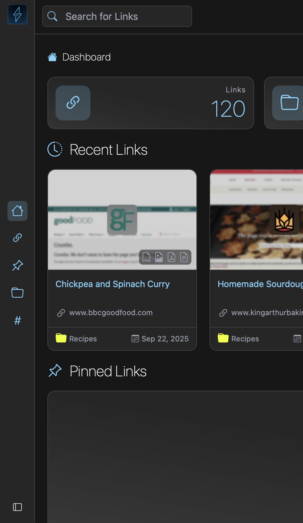
I can see from the screenshot they still haven’t fixed the title text being cut off in each bookmark.
Hey there! The screenshot was cropped, not sure which part you’re talking about
Each bookmark card does not make enough room for the title of each bookmark, so they’re cut off with an ellipses at the end. The readability while looking over your bookmarks is pretty bad as a result. Like after a certain point that’s unavoidable, but it doesn’t help that the spacing and margins in each card are excessive.
KaraKeep uses a similar card layout and handles it much better as a counter example.
Oh, you can adjust the view to your preference.